Friday, 18 December 2015
Thursday, 17 December 2015
Class Feedback: First Draft
Today all of our classmates watched the first draft of our film and they all gave us feedback in order to improve our film. We took on board all of the feedback and decided to make amendments to our film.
Improvement comments:
Improvement comments:
- A low angle camera shot could be used.
- You could put transitions on the titles to make them more interesting.
- Make all the titles the same colour so it looks professional.
- The voice-over is too quiet at times.
- I think you need to justify the black and white scene.
- Make the shots transition better as it looks jumpy.
- The shot of the teacher getting angry at the end goes on for too long.
- Text messages could be displayed to show more of the abuse she receives.
- Foley sounds could be used.
- It ends abruptly with no direction.
Our response and improvements we made:
In response to our feedback we included a shot of the actress walking down the stairs with it focusing on her feet and legs as this adds more variety. We decided to add cross fade onto the titles so that they flow better and seamlessly. Also we changed the font and made all the titles black so that it looked more professional. These also now reflect the nature of a drama, which is our genre, as they look formal. We moved the voice-over of the insults so that they could clearly be heard and also we increased the volume of the main voice-over to 22 decibels as it is very important for the story-line and needs to stand out. We decided to have the 'in-mind' scene in black and white to make a clear contrast between her normal life and how the girl actually feels. Depression and other mental illnesses make you have very dark thoughts and many people feel trapped in a never-ending dark place where there is no escape so by putting the shots in black and white is reflects this and also makes the point that we are inside the girl's head. We filmed and added more shots in order for the story-line to flow better and for it not to be jumpy. The shot of the teacher getting angry has now been cut and a few shots follow this as it became uninteresting and didn't really add any enigma to our opening. We took into consideration the feedback and decided that it would be a good idea to include a shot of abusive text messages to emphasize why she is depressed and what she's having to deal with. The shot also breaks up the multiple long shots included and also gives more variety to the shot list. We decided to add foley sounds of the character walking up and down the stairs and also of the door opening/closing so that it sounded clearer and realistic. We noticed ourselves as did others that our film opening ended abruptly with no real direction therefore we decided to add more shots of her walking out the classroom with another section of voice-over and introducing a new character which will help the girl and tell her story of her battle with depression. This would allow our film opening to seem like an actual film opening as it now would have direction and could be actually seen as carrying on.
Teacher Feedback: First draft
The feedback we got from our teacher was that the sound and voice over was really good, but needs to be separated so that the viewers don't get confused as to what they are supposed to be listening too. Also there needs to be more to the ending of the opening such as more enigma code, as it is not clear as to what is going to happen next. The titles need to be adjusted to the same font, the correct order and the same length. Finally put Film Nations sooner in the opening, and justify why we have used black and white on our blogs.
Friday, 11 December 2015
Thursday, 10 December 2015
Our final titles
When
researching our titles we decided to follow Zodiac however along the way
some titles changed and we also decided to change the font and colour
due to class/teacher feedback. Below is the order and timings of our
titles that appear in our final draft. The majority of our titles our
four seconds long excluding the film institutions.
Title one: 0-0.12
This is our first production company: Association of Technical Collaborative Media and this lasts for 12 seconds. Since this is our main and original film company we wanted it to go first and also be on screen for the longest time as we aim to get publicity from this.
Title two: 0.13-0.18
This is our second production company: Film Nation Entertainment and it lasts for 5 seconds.
Title three: 0.18-0.23
This is our third production company and it lasts 5 seconds long as well. As these two production companies are equally weighted within our film they share a 5 second gap each.
Title four: 0.24-0.28
This is our first title of the film 'A Film Nation Production' and we took inspiration from Zodiac. This is on screen for 4 seconds.
Title five: 0.32-0.36
This title says 'In association with Focus Features' and it also lasts for 4 seconds.
Title six: 0.36-0.40
This title says 'Shot and edited by Toby Lee' and it also lasts for 4 seconds.
Title seven: 0.41-0.45
This is the main title of our film therefore it is in capital letters and much larger than the other titles. This title again lasts for 4 seconds however the bigger font makes it draw in the audiences attention more.
Title eight: 0.45 - 0.48
This title says 'Directed by Maisie Smith' and it lasts for 3 seconds.
Title nine: 0.49-0.53
This title says 'Written by Clare Kelly' and lasts for 4 seconds.
Title ten: 0.53-0.57
This title says 'Audio Director Lucy French' and it also lasts for 4 seconds.
Title eleven: 0.57-1.01
This title says 'Lead Cinematics Oliver Brown' and it also lasts for 4 seconds.
Title twelve: 1.03-1.07
This title says 'Lead VFX Toby Lee' and lasts for 4 seconds.
Title thirteen: 1.07-1.11
This title says 'Music by Maisie Smith' and it also lasts for 4 seconds.
Title fourteen: 1.14-1.18
This title also lasts for 4 seconds and has the main actors names 'with Clare Kelly And James Fussey'.
Title fifteen: 1.24-1.27
This title lasts for 3 seconds and says 'Edited by Toby Lee'.
Title sixteen: 1.29-1.33
This title says 'Casting by Meg Kitley' and it also lasts for 4 seconds.
Title seventeen: 1.33-1.37
This title says 'Produced by Ellie Reynolds' and lasts for 4 seconds.
Wednesday, 9 December 2015
Film poster

Displayed above is our film poster. When designing the film poster I knew it had to be dark and hazy just like the feelings and thoughts our main character would be going through. to achieve this I used Adobe Photoshop CS6. After capturing the picture of our main character I imported it into Photoshop and immediately coloured the background a dark grey. Because there is noting else in the poster you are really attracted to the expression displayed on the main characters face. I then used the fill tool to gradually fill in parts of the hair and face in the same shade of grey to accent darkness and to bring her face out even more. I then added the title right in the centre in blood red so that it would stand out and people would be drawn to it. The credits box at the bottom was always a priority. This is because it adds a professional feel to the poster. I used a template in order to achieve this look downloaded from videocopilot.net.
Thursday, 3 December 2015
How our titles will appear in our film opening
Our titles will appear on the screen in the following order:
- A Toby Lee Film
- Clare Kelly, James Fussey, Maisie Smith, Alexander Steele, Martyn Gray, Eddie Hamblin, Josephine Worsley....
- Casting By Clare Kelly
- Costume Design By Clare Kelly
- Sound Designer Maisie Smith
- Original Score By
- Music Supervisors Clare Kelly and Toby Lee
- Edited By Toby Lee, Clare Kelly and Maisie Smith
- Production Designer
- Director of Photography Toby Lee
- Executive Producer
- Produced by Clare Kelly, Maisie Smith and Toby Lee
- Screenplay by
- Directed by Maisie Smith
Monday, 30 November 2015
Sunday, 22 November 2015
Representation
Our film opening will represent mental health problems within teenagers. Many teenagers nowadays suffer in silence and are forced to cope with poor mental health alone. We wanted to make a difference with our film opening and include real life situations within so that it can become not just an emotional film but a relatable one. Our film also represents the struggles of teenage life and how although many adults believe they have it easier than anyone they don't and we will show that the stress of school and bullying impacts on teenagers mental health hugely. We aim to represent security and freedom for those many teenagers who feel embarrassed or ashamed of their mental health. We want to show that it can truly happen to anyone and by getting inside the mind of a real teenager we hope this will allow others to know they're no alone. Also the harsh scenes and script that will be shown in the film opening will shock some people which is what we want because the majority of the time mental health isn't taken seriously and we want to represent the seriousness of it and help those who suffer.
Statistics:
- One in ten children between the ages of one and 15 has a mental health disorder. (The Office for National Statistics Mental health in children and young people in Great Britain, 2005)
- Estimates vary, but research suggests that 20% of children have a mental health problem in any given year, and about 10% at any one time. (Lifetime Impacts: Childhood and Adolescent Mental Health, Understanding The Lifetime Impacts, Mental Health Foundation, 2005)
- Rates of mental health problems among children increase as they reach adolescence. Disorders affect 10.4% of boys aged 5-10, rising to 12.8% of boys aged 11-15, and 5.9% of girls aged 5-10, rising to 9.65% of girls aged 11-15. (Mental Disorder More Common In Boys, National Statistics Online, 2004)
Shooting Schedule
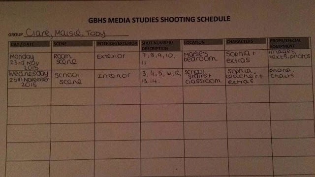 Our shooting schedule was useful when shooting as we knew exactly what and when we was going to be shooting specific shots. It was helpful as we knew what we needed to include such as a phone, we also knew which actors we needed for the shoot. Shot 1 and 2 are of production companies, therefore they are not included in the shooting schedule.
Saturday, 21 November 2015
Adobe Premiere edit practice
In todays lesson (09/09/15) we used an editing software called 'Adobe Premiere' this enables us to add effects different videos and add sound to the video. Our task was to create a video involving dancing animals and James bond for about two minutes. We learnt throughout the lesson how to edit using Premiere below is my dancing animals and James bond video.
Analysis of my video
It took me a while to adjust to using adobe premiere when doing the dancing bears task. this is because I found it difficult to edit and to know where certain edit designs are. I learnt a lot from doing the task as I learnt how to use adobe premiere and I learnt what effects are best for what thing, therefore at the end of the task I was confident in using the software. I used the black and white effect in my video, I used an effect which created multiple images on the screen at the same time which I quite liked. The dancing bears video consisted of different small videos that I had to merge together which made the full video. I made sure I had a different effect on each different small video so that I learnt how to use different effects and so that the video was interesting for viewers.
The James bond video consisted of videos from the film itself and sound from the film, I added effects to make it more interesting for the viewers.
Friday, 20 November 2015
Location for our film opening
After establishing we were going to shoot in a school I scouted ours for a great location to film. After searching various places I thought that music department would be best. This is because of the great features that will improve the way we stage our film. The staircase will be a great feature to the film as we can emphasize the stress of the girl by having her run, stomp and maybe even fall down the stairs. After taking some shots in the classroom I also quickly spotted that there are a variety of angles from which we can film at. The table layout will also help as we can have her sitting in a row all by herself at the front or back. The photo that was taken from the back left of the class shows how the whiteboard is central and big. This way we can write horrible comments and messages about her on it. Also we could use the PC screens to display other horrid stuff.
Timeline for our film opening
Wednesday, 18 November 2015
Shot list for our film opening
Shot list:
- Columbia
- ATCM
- Establishing shot of Sophia walking up the stairs (variety of shots).
- Match on action shot of Sophia walking into the classroom.
- Long shot of Sophia sitting down on a chair in the front row with people laughing at her, whilst the teacher continues to teach.
- Close up shot of Sophia's face, this is also a tracking shot that flickers from the classroom and her bedroom.
- Close up/ mid shot of Sophia sitting on her bed crying.
- Stop frame motion of distorted images, messages, and pictures.
- Over the shoulder shot of her looking at the images.
- Close up of her crying.
- Tracking overview shot of her bedroom with the images.
- Long shot of the classroom (Sophia is getting shouting at).
- Close up of text messages.
- Long shot of Sophia running out of the classroom.
- Shots with the titles and credits.
- Final shot with the title 'IMPACT'.
Evidence of group planning for our film opening
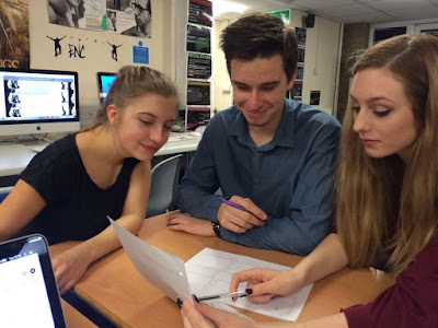
Here are some photos of our group: Clare, Toby and Maisie, planning for our film opening. In the first picture we are sorting out the job roles so that we can share responsibility equally. Also we are planning out the storyboard for our film opening. As you can see we are all working together to make sure everyone is doing their work and having an opinion in the final opening.
Title research for our film opening

For our film we have decided to use a similar font to Orphan Black as we can see that it fits the genre so we have chosen to use the font: Lithos Pro Regular. The titles will be capitalised as Orphan Black inspired us.
Example:
Impact
Clare Kelly
In association with AtcmWe feel as if this would also look similar to handwriting and we will used editing software to have it typed on the screen as this relates to bullying within media. We chose the title name as IMPACT as we want people to realise the impact bullying has on people's lives. We also want to create an impact with our film opening so that hopefully it will influence people's lives.
Risk Assessment for film opening
This is the risk assessment for when we are going to film in the classroom. It includes all the possible risks of filming in a classroom and resolutions for these hazards.
There is also a risk assessment for when we are going to film in my bedroom. It includes all the possible risks of filming in my bedroom and resolutions for these risks.
The risk assessment is extremely important so that we take into account the hazards and try our best to prevent them. If anyone was to get injured it would e our responsibility therefore having a risk assessments highlights the problems and states solutions for them.
Tuesday, 17 November 2015
Final film idea pitch

This is our final pitch idea that we presented to the class to get their feedback on our idea. This PowerPoint shows everything that is needed in our film opening and the main idea we are going to use.
Monday, 16 November 2015
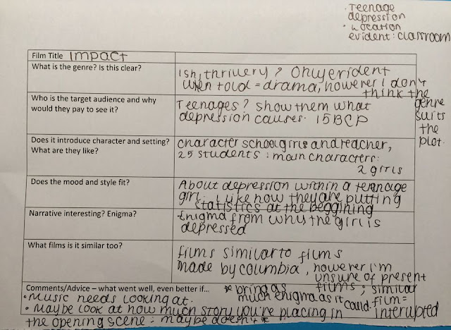
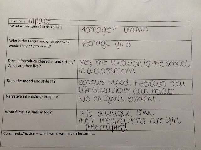
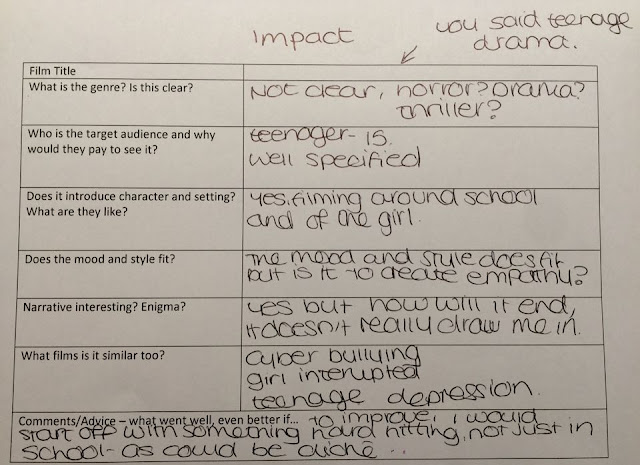
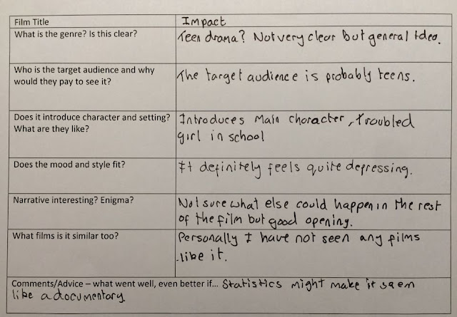
Class and teacher feedback
In today's lesson we presented our film opening's to our fellow class
mates and they all gave us feedback so we could see what we needed to
improve on.
Here is our teacher's feedback:
 Improvements:
Here is our teacher's feedback:


 Improvements:
By
reading through our feedback we have realised that certain things could
be made clearer and we have decided to make improvements based upon our
feedback. Some feedback we got from multiple people was they were
unsure if the genre would be made clear in the film opening. We made our
genre a drama due to the serious topics covered in the film opening and
we will put emphasis on the icons and script we use to film to make
sure that the genre is as clear as possible. Also many people thought
that the film opening would seem more like a documentary than a feature
film due to the statistics. We listened to these feedback and decided to
only have 2 statistics in the beginning of the film relating these to
the characters, for example: '1 in 14 teenagers suffer with a
depression' we decided to have 14 students in the classroom and our main
character will be the one with the mental health disorder therefore
linking the statistics to the film. The music we originally chose was 'I
due fiumi' by Ludovico Einaudi however by listening to the feedback and
doing our own research we realised that due to the song being published
in 2001 it is copyrighted and therefore we wouldn't be able to use it.
Therefore we have decided to do some research and find other songs which
reflect the mood of the narrative and also are copyright free. A
comment that stood out for us was the establishing shot being boring. We
originally planned for the first shot to be of the classroom to
establish the setting however after listening to feedback we want it to
be more effective. Finally, many people said that our film opening
wouldn't leave room for enigma as we include a lot of the story line in
the first few minutes and also that there is no cliffhanger. Therefore
we decided to change the script slightly so that there is more mystery
and the film opening ends with the audience wanting to watch more.
Mood board for our film opening
The
mood board shows everything that is needed and that we used to have
influence on the opening scene. First we start with the idea. The idea
of the opening scene is based around depression among teenagers. This
includes ages from 13 all the way up to 19. We really wanted to
emphasise that teenage depression is a serious and forever growing issue
that needs to be raised more. This is why the mood board includes
several quotes and disturbing pictures to do with teenage depression.
One particular quote on the mood board is particularly distressing and
that is the one that says; 'Depression is like a war. You either win or
die trying.' I feel this really emphasises the issue and would like to
include most if not all of these. An idea of depression can link also to
an idea of loneliness, pain, suffering and darkness. This is why there
are many photos that are of people who feel disconnected, singled out.
Secondly
I had to focus on setting. Where are there a high concentration of
teenagers? Answering this question was simple but why did we need this? I
think that if we show one single student in a class full of what they
would think are 'normal kids' this would emphasis the struggle and
singled out feeling of the depressed character. The number of students
was also key. A statistic released last year shows that 1 in 14 teens
suffer depression therefore why not have a class of 14 students with her
as the 1 who suffers. This way we are including fact without directly
telling the audience making this more of a film than a documentary.
Thirdly
we had to think of a twist that would make our film stand out. Make it
seem independent. To do this we bravely decided to attempt a sort of
dream sequence in which we show the main character fading in and out of
thoughts of herself in her bedroom with flickering lights. To show
clearly we are inside her mind things that she thinks about her self,
names she's been called and thoughts she has had will be posted around
her on her bed, wall, mirror, and dressing table. Also images of how she
sees herself will be printed onto templates of old polaroid negatives.
On posit notes and in the blank space underneath the images we can
include titles.
Lastly
we had to show evidence of this in the real world rather than in her
mind. Therefore we decided that we would include an image of her phone
as she is shouted at by the teacher. On her phone horrid text messages
and pictures will be displayed.
In
conclusion this story board will help keep inspiration flooding into
this film in every way possible. We are all excited to make this film
and cannot wait to share it with you all!
Music for the film opening
This is one of the songs that we are going to use in our film opening.It is called 'Dreams become real' and is composed by Kevin MacLeod. The title of the song connects with our film opening as the dreams of Sofia's enemies want her to be unhappy and throughout the film she gradually gets more unhappy therefore their dreams happen. It also shows a contrast with our film opening as it shows that not everybody's dreams become real, as Sofia's dream would be to not get bullied and insult by others.
The song is in a minor key this reflects the sad mood of the song, the pedal note plays a ostinato in some parts of the song therefore it is repeated to keep the rhythm inside the listeners head. The melody varies as the sequences change, the dynamics are mostly quiet (p). The song is also calm and quiet.
This is the other song we are going to use in our film opening. It is called 'I am a man who will fight for your honor' and is composed by Chris Zabriskie. The title of the song is relevant to our film opening as it shows that we should fight for our honor, therefore Sofia should fight to stay alive and to stay strong ignoring all the hateful messages.
The song is in a minor key just like the other song because the minor key is mainly used to create a dark, depressing feeling for the listener. We used songs with minor keys because our film opening is a drama that includes sad moments, therefore these songs portray the mood of the film opening. Obviously we will only use a bit of this song as it is 11 minutes plus and our film opening should be around 2 minutes.
Props for the film opening
Icons used in our film opening:
The following list of props are all needed to create effect within the opening.

The following list of props are all needed to create effect within the opening.
- Post-it notes - These are going to be used for the credits in the opening. These ideally will be stuck around the white board which will be on the wall in Sofia bedroom.
- Printed photos with captions - These are going to be used to show the insults Sofia gets from other people. These may also be used for the credits in the opening.
- White board- The white board will be used for the credits and to stick the printed photos and the posits.
- Chairs- The chairs will be used in the scene that is set in the classroom as the students will be sitting on the chairs.
- Desks- The desks will be used in the scene that is set in the classroom as the students will be using the desks to complete their work.
- Pens- The students will be using pens to complete their work in the classroom scene.
- Textbook- The textbooks will be used in the scene that is set in the classroom as the students will be using them to learn from throughout the lesson.
- Bed- This will be used when the main character is upset and crying on her bed.


Audience for the film opening
Audience:
 The primary target audience for our film opening is teenagers, this is shown in the opening as the main character is a teenager. There were two films that influenced us 'Girl, interrupted' and 'Its kind of a funny story', both of these films appeal to teenagers because of the drama side to them, also because of the teenagers featured in the film.
The secondary target audience is parents as they would want to watch a film that involves teenagers so that they can relate to there child's behaviour and support them in any way they can. This may appeal more to middle age women than men as women tend to relate to dramas better than men.
The secondary target audience is parents as they would want to watch a film that involves teenagers so that they can relate to there child's behaviour and support them in any way they can. This may appeal more to middle age women than men as women tend to relate to dramas better than men.
Subscribe to:
Comments (Atom)


